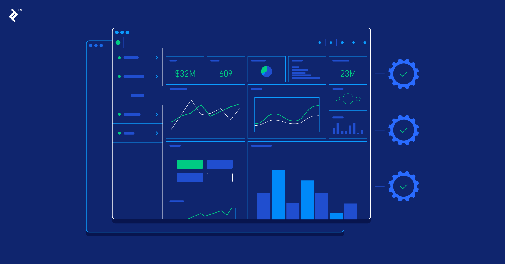
Real-time features are everywhere now. Release monitors push build status. Ops rooms track latency spikes. News tickers roll across homepages. The promise is clarity under pressure, yet many “live” views still overwhelm. The difference between chaos and calm is not bigger charts. It is small design choices that make fast data readable, trustworthy, and engaging to the eye.
A practical way to understand pace, context, and update cadence is to observe live interfaces designed for large audiences. Sports dashboards are useful case studies because they condense time, state changes, and human stakes into a single screen. For a compact example of how a feed frames tempo and context without burning the viewer, read more – notice how the screen stages what changed, when it changed, and why the next beat matters.
Why real-time needs rules more than speed
Faster is not always clearer. Dashboards that update every second can still be confusing if states are ambiguous or if numbers slide around the grid. Real-time design works when each element has a role that remains constant. The eye learns where to look for the score, where to scan for trend, and where to confirm the moment of the last update. That stability makes spikes intelligible. It also keeps teams from chasing ghosts.
Another reason to slow the mind while the data runs fast is trust. Timestamps anchor reality. A simple “Updated 21:02:07 – source: stream A” line reduces arguments. Units do the same. A number labeled ‘requests per second’ reads differently from ‘requests per minute’. Consistent units end hallway debates and shorten the time to action.
Core patterns that keep live data readable
- One-screen truth – the key state, the last change, and the next decision are visible together. No hunting through tabs.
- Fixed anchors – score, KPI, or system health stays in one corner. Trend lanes never swap sides. Muscle memory forms fast.
- Reason codes – when a number jumps, a short tag names why. “Deploy 14.8 finished” or “Region B throttle enabled.”
- Gentle motion – animations are short and linear. No bounces. Motion says “changed” rather than “celebrate.”
- Paced polling – cadence matches utility. Critical lanes update fast. Context lanes update more slowly to avoid flicker.
- Safe pauses – a freeze button and a snooze for alerts let people think without losing the thread.
- Clear exits – drill-downs open as sheets, not new worlds. One click closes the rabbit hole.
These patterns look modest. They are the difference between a dashboard that teaches and a dashboard that shouts.
Architecture that serves the screen – not the other way around
Good live UX starts upstream. Raw streams do not belong directly on the canvas. A thin pipeline that cleans, aggregates, and caches makes every pixel smarter. Ingest nodes normalize events and attach identifiers. A transformation layer converts bursts into stable windows – rolling sums, medians, and percentiles that humans can easily interpret. A cache close to the client trims jitter and avoids stampedes during spikes. The UI then asks the server for state in verbs the product understands – “give health for the last five minutes” rather than “dump all events.”
Backpressure must be visible. When upstreams slow down, the UI should clearly indicate this. “Data delay – fetching last stable window” beats silent staleness. The same clarity applies to outages. Honest emptiness earns more trust than fake numbers. A greyed chart with a clean message respects the user and prevents bad decisions.
A quick build plan that ships without chaos
Shipping live features safely is a deliberate process. Start by defining the smallest truth the screen must hold. For a release dashboard, that might be commit health, error rate, and deploy status. Then pick the cadence that matches each lane. Health may poll every 2-5 seconds. Context may poll every 30-60. Add a freeze toggle on day one, so teams can stop-motion during incident reviews. Lock layout scaffolding early to prevent anchors from jumping. Finally, write the reason codes before wiring the stream. No one writes them later. The code is the user’s audit trail.
Stakeholders will ask for tabs. Resist until a single canvas is saturated. Tabs multiply attention splits. If a second view is required, make it a layered detail view that opens from a single anchor. One step in. One step out.
After the spike – turning nights into knowledge
Great real-time UX ends with a tidy memory. A recap module that lists three drivers – pace, reason codes, and impact – teaches more than a gallery of charts. Link the recap to a shareable snapshot so that teams can annotate and hand context to morning crews. Keep a ledger of state changes with timestamps and human-readable tags. That ledger saves meetings and keeps postmortems honest.
The social layer matters too. Teams that run live dashboards well develop a tone. Calm captions. Respect for pauses. A habit of celebrating process improvements rather than lucky saves. Product owners can model this by removing confetti, stamping dates on images, and praising small fixes that reduce alert noise. Culture follows the screen.
The last mile – real-time that earns a second look
Users return to live views that behave like good colleagues. They speak plainly. They keep their promises. Likewise, they help at the moment and stay quiet when nothing matters. The craft is modest – fixed anchors, reason codes, honest timestamps, and gentle motion – yet the effect is large. Incidents shrink. Debates get shorter. Teams trust what they see. Building with that north star and a real-time dashboard stops being a spectacle. It becomes a working tool that makes fast decisions feel measured and right.

