
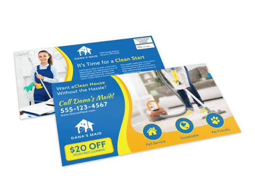
Every Door Direct Mail is one of the more straightforward tools available to local businesses. You select a carrier route, print a postcard, and the United States Postal Service delivers it to every address on that route without a mailing list. The mechanic is simple. The execution, however, is where most campaigns fall apart.
The majority of EDDM failures are not postal failures. They are design failures. A postcard that arrives at the door but does not communicate anything useful within two seconds has done nothing for the business that paid to print and mail it. The cost of printing and postage is fixed regardless of whether the piece works. That makes design the only variable that actually determines return on investment.
What follows is a practical breakdown of the most common design mistakes that diminish EDDM postcard performance — and what the better approach looks like in each case.
Why Design Decisions Have Real Business Consequences in Direct Mail
Direct mail operates under conditions that most digital marketing does not. A postcard has no algorithm to help it reach the right person at the right moment. It arrives in a physical stack with other mail, competes for three to five seconds of attention, and either earns a second look or gets discarded. There is no retargeting. There is no second impression unless you send another piece. Reviewing well-executed eddm postcard samples before designing your own campaign reveals a pattern that most struggling campaigns ignore: every element on the card serves a function, and none of them are decorative.
Understanding this changes how designers and business owners approach the format. The postcard is not a flyer or a brochure. It is a single-surface communication tool that must work immediately and completely. Mistakes in layout, hierarchy, or messaging do not get corrected in follow-up sections — there are no follow-up sections.
The Cost of an Ineffective Piece Is Not Just Printing
When a postcard fails to generate a response, the sunk cost includes design time, print production, and postage across an entire carrier route. For a small business mailing to several hundred or several thousand addresses, that is a meaningful financial exposure. More importantly, a failed campaign often leads to the conclusion that direct mail does not work, when the actual problem was a correctable design issue. That misdiagnosis costs businesses future campaigns they would have otherwise run successfully.
Mistake One: Too Much Text, Too Little Clarity
The most consistent pattern across underperforming EDDM postcards is overcrowding. Business owners understandably want to communicate everything about their service — pricing, credentials, service areas, hours, testimonials, and offers — all on one card. The result is a surface with no visual hierarchy and no clear entry point for the reader’s eye.
Effective postcards are built around one primary message. That message should be readable from an arm’s length without squinting. Supporting details exist to reinforce the primary message, not to introduce new ones. When every piece of information is given equal visual weight, nothing registers as important.
What Restraint in Messaging Actually Looks Like
A well-designed postcard identifies what the recipient needs to know first: what you offer, why it is relevant to them, and what to do next. That is the full message. Everything else — service lists, company history, technical certifications — belongs on your website or in a follow-up conversation. The postcard’s job is to earn that conversation, not to replace it.
Mistake Two: Weak or Absent Visual Hierarchy
Visual hierarchy is the principle that governs how a reader’s eye moves through a design. According to foundational principles documented in communication design literature, including those described by the Gestalt school of visual perception, humans group and prioritize visual information based on size, contrast, proximity, and alignment. A postcard that ignores these principles forces the reader to do work that most people will not do with unsolicited mail.
Without clear hierarchy, a postcard becomes a wall of equal-weight elements. The headline does not feel like a headline. The call to action does not stand out. The business name and the offer appear to carry the same importance, even though they serve completely different functions.
Building a Hierarchy That Works at a Glance
The primary visual element — whether a headline, an offer, or an image — should dominate the layout. Secondary elements like contact information and service descriptions should be noticeably smaller and positioned to support rather than compete. If a reader can identify the most important element on the card within one second without reading anything carefully, the hierarchy is working correctly.
Mistake Three: Images That Confuse Rather Than Communicate
Many EDDM postcards include imagery that looks professional in isolation but does not support the message of the card. Stock photography of smiling families, generic cityscapes, or abstract backgrounds often falls into this category. The image takes up significant real estate without clarifying what the business does or why it is relevant to the reader.
Images in direct mail should do specific work. A roofing company benefits from showing a finished roof. A landscaping business benefits from a before-and-after comparison. A restaurant benefits from food photography that creates appetite. The image should be the first argument for why this card is worth reading.
When Images Actively Harm a Postcard’s Performance
A low-resolution image printed at postcard scale looks immediately unprofessional, and that first impression transfers to the business itself. Similarly, images that are too busy or too dark reduce the legibility of text placed over them. The image and the text must work together, not compete for the same visual space. A postcard that requires a reader to work out what they are looking at has already lost their attention.
Mistake Four: No Clear Offer or Reason to Act
An EDDM postcard that describes a business without giving the recipient a reason to respond is a missed opportunity. The description alone is not enough — most people receiving the card already have service providers for whatever you offer. The postcard needs to give them a reason to consider switching or to keep your card for when their current situation changes.
A clear offer creates a decision point. It answers the implicit question every recipient has when looking at a piece of mail: why should I care right now? That offer does not need to be a discount, though discounts are often effective. It can be a free estimate, a seasonal reminder, a new service that did not previously exist, or a time-sensitive availability window. The key is that the offer is specific and actionable.
Offers That Are Too Vague to Drive Action
Phrases like “quality service at competitive prices” or “call us for your needs” do not function as offers. They are descriptions that most competitors could also use. A functional offer gives the recipient something concrete to respond to — a specific percentage off, a free first appointment, a guaranteed response time. Vague value statements leave the decision entirely with the reader, and most readers will decide to do nothing.
Mistake Five: Contact Information That Is Hard to Find
It is common for business contact details to be placed in the smallest font on the card, tucked into a corner or footer as an afterthought. This creates a situation where a reader who is interested in the offer cannot easily find out how to respond. By the time they locate the phone number or website, some portion of that initial interest has faded.
Contact information should be prominent enough that a recipient can act on impulse. If they have to search for how to reach you, the postcard has introduced friction at exactly the wrong moment.
Mistake Six: Fonts and Color Combinations That Reduce Legibility
Decorative typefaces, low-contrast color pairings, and small body text all create the same outcome: a postcard that is harder to read than it needs to be. Legibility is not a stylistic preference — it is a functional requirement for print communication. A postcard that cannot be read clearly in ordinary indoor lighting has failed before the message has even been processed.
Print Legibility Differs From Screen Legibility
Designs that look clean and readable on a monitor often print differently. Colors shift. Fine type can fill in or break apart at print resolution. Light text on a slightly lighter background, which appears readable on screen, can become nearly illegible on a printed surface. Reviewing physical print proofs, not just digital previews, is the only way to catch these issues before committing to a full print run.
Mistake Seven: Ignoring the Back of the Card
EDDM postcards are printed on both sides, but many businesses treat the back as secondary space — minimal text, repeat of the front logo, or blank except for required postal information. This wastes half of the available communication surface.
The back of the card can carry supporting information, a secondary offer, a service list, or a map that reinforces local relevance. Effective eddm postcard samples typically use the back to either deepen the primary message or provide practical information that makes the card worth keeping. A postcard someone holds onto is one that continues to work after delivery day.
Mistake Eight: No Connection to the Specific Audience or Area
One advantage of EDDM is geographic precision. A campaign can be targeted to specific neighborhoods, zip codes, or carrier routes based on where the ideal customer lives. Postcards that ignore this specificity miss the opportunity to speak directly to the reader’s context.
A generic postcard that could have been sent anywhere feels like it was sent to no one in particular. A postcard that references the local area, a nearby landmark, or a specific seasonal condition relevant to that geography feels more personal and more credible. Readers notice when a business has made an effort to be relevant to their specific situation.
Mistake Nine: Inconsistent Branding Across the Piece
When the colors, fonts, and tone of a postcard do not match a business’s existing branding, it creates a disconnect. A recipient who visits the business’s website or storefront after receiving the postcard should recognize the same visual identity. Inconsistency signals that the postcard was produced quickly or without coordination, which raises questions about the consistency of the service itself.
Branding consistency is not about rigid uniformity. It is about creating a recognizable and trustworthy visual presence across every touchpoint. A postcard is one touchpoint, and it should reinforce the others rather than contradict them.
Mistake Ten: Skipping the Proof Stage
No design, regardless of how carefully it was created on screen, should go to print without a physical proof. Print proofs catch color inaccuracies, legibility issues, bleed problems, and text placement errors that are invisible on a monitor. A missed error in a print run of several thousand postcards is an expensive and irreversible problem.
The proof stage is also the moment to evaluate the card as a real object in real conditions — held at a normal reading distance, reviewed under typical indoor lighting, compared against competing mail pieces. Many layout decisions that seemed reasonable on screen become obviously problematic when the card is held in hand. Reviewing strong eddm postcard samples during this stage gives designers a calibrated reference point for what works at scale.
Closing: What Good Design Actually Signals to the Reader
A well-designed EDDM postcard communicates something beyond its printed message. It signals that the business behind it pays attention to detail, respects the reader’s time, and operates with a degree of professionalism that extends to how it presents itself. These are the same qualities most customers look for in a service provider.
The ten mistakes described here are not obscure or technical. They are consistent patterns visible across thousands of campaigns, and they are all correctable before a postcard goes to print. Businesses that take the time to evaluate their design against real eddm postcard samples — pieces that have already demonstrated what clarity and structure look like in this format — consistently produce work that performs better than those that design in isolation.
Direct mail is a durable channel when it is executed well. The postcard format in particular rewards simplicity, directness, and visual discipline. Removing the common design errors described here does not require a larger budget or a complete creative overhaul. It requires a more deliberate approach to a format that works best when it does less, not more.
